

.
Hix ! You’ve nailed your marketing, it’s cool.
I don’t know what such manga-esque cartoonery has to do with hotels, but the imagery, a little like the show, is edgy. Lighting, as we all know, can make a huge difference to a space, and Hotels are one of those interesting areas where making a first impression is paramount, after all once you’ve got your punters in, you want them to come back, and tell all their friends all about it.

.
HIX is Europe’s only Hotel design event, last year’s event welcoming 3700 ‘guests’ at Islington’s BDC. As only a few days separated this November event from ‘Light 23’ I did wonder if the lighting companies exhibiting here were going to stick around and do that show as well, also would it be any different, is there such a thing as just hotel lighting? Short answer is yes and no, the majority of exhibitors were at both events, and the products on show where they changed at all, it was just around the edges.
.
.
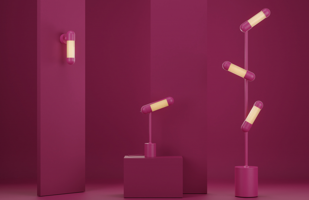
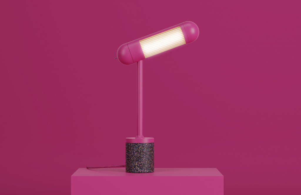
The first product that caught my attention was an audacious pink. My first reaction was “My god, but that’s a kitsch colour”. It was as if someone had been watching Barbie on repeat for a couple of days whilst drinking Red Bull . . . and then needed an emotional design outlet to express their passion for the film. On closer inspection the light is more than just its colour. I had a chat with Michael Lawrence, Marketing Co-ordinator about the products.
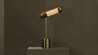
‘We are R&S Robertson Lighting and today we are showing our ‘85’ collection in celebration of our 85th birthday. This range is called the Hudson, inspired by art deco 1920’s & 30’s with a shape like the New York Central Hudson train, the desk lamp mirrors the rounded pill shape. We would see this being used in hospitality settings, hotel rooms or a desk in the reception. It is shown here in the bright pink, but we also have the brass and black, in fact the product is customisable on request, to any RAL colour you wish’.
CF : How about sustainability ?
‘It’s an LED source with component parts all being designed to be replaceable, to extend the product life, this includes the lamp. The base is made from recycled plastic, and we are very accommodating when it comes down to customisable elements, RAL colours pantone, also everything can be recycled’.
I am glad I didn’t let the pink put me off (it was a close call!), because I love the product semantics, and was impressed with the process by which the product range was born. The company enlisted product designers from all over the UK to create 5fiveranges of lights for the hotel market and the designers conducted extensive interviews to ascertain the ever-evolving trends in finishes, lighting styles etc and . . .
Huzzah – Hudson was the end result.
.
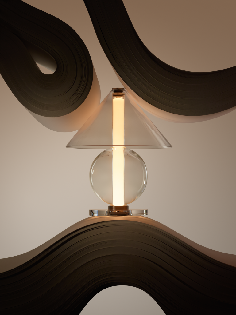
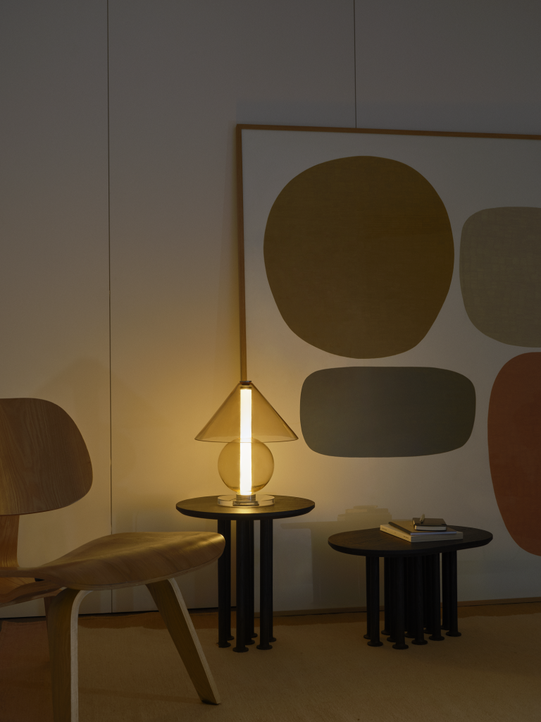
Next up was a company who I reviewed last year, Marset. Speaking to Alexander Box (Area Sales Manager) she explained a little about the product ‘Fragile’, designed by Jaume Ramírez
‘His inspiration came from those lamps designed in the 70’s and 80’s, the typical big base, textile shade. Jaume wanted to give an essence of the past whilst using a more fragile material, which is blown glass. It’s composed of two geometric parts, the cone, and the sphere. The top shade is held onto the base by a magnet which gives the shade a little protection from damage as the top shade has some movement when pressure is applied. This is a statement piece, which we see being used in a lobby or living room’.
.
.
The thing I like about this product is the way the central light forms part of the luminaire, whilst producing a soft diffuse glow. The shade is a nice touch as well, the fact it has a bit of ‘give’ means that instead of knocking it to the floor when accidently brushed, your product stands a better chance of surviving!
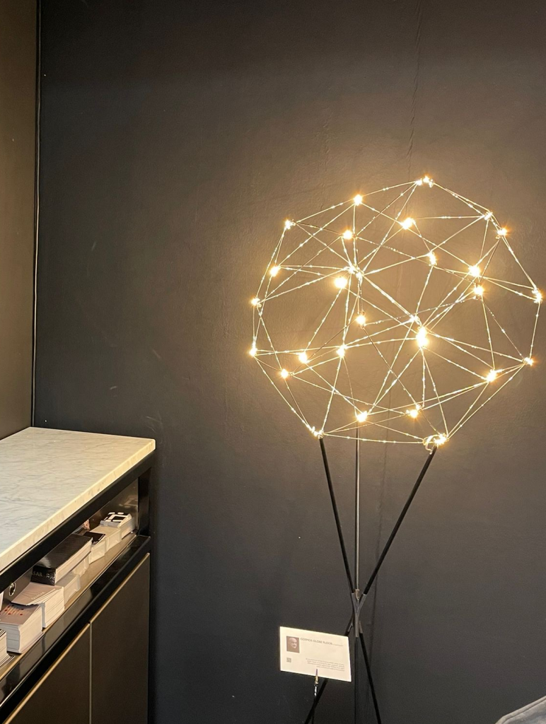
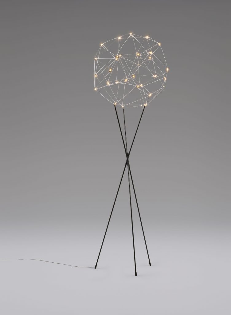
From reinventing the past, to the cosmos, a massive leap into space, time and floor mounted lamps. Arjens Van Gammeren, owner of Quasar gave us his musings on this product. ‘The cosmos floor lamp from Quasar is formed of randomly placed LED’s forming a globe. The rods are made from a shiny material (nickel), reflecting the LED’s which are 2400 Kelvin, giving a very cosy warm glow; it is also available in both brass and black. The globe is placed on three points and fixed by magnets, the leg supports are very light weight and are produced by 3d printing, this gives the whole product an airy appearance. It is a handmade product (apart from the 3D part) and not one that we sell hundreds of, making it very exclusive. The light can be dimmed and people who have this product even use it during the day, as the effect of the light is so attractive’.
.
.
LED circuit boards are fixed with two tiny screws, so lamps can be replaced by just unscrewing them. In the packaging of the luminaire two replacement LEDs are provided should the need occur. The product in the UK is sold through Lightingspiration, we are glad they are supporting this range in the UK!
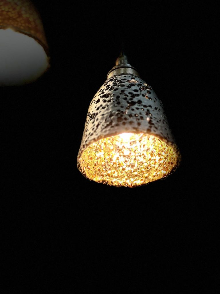
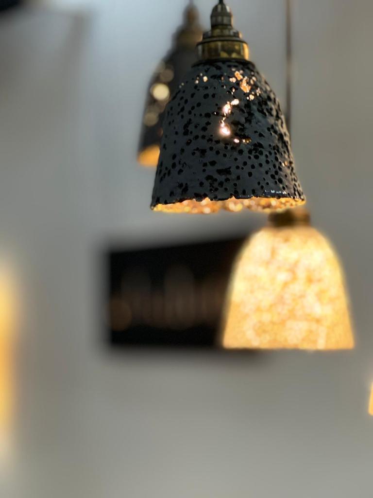
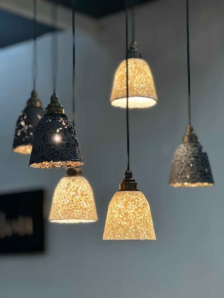
GOLD ! And pendants, lovely bubbly pendants with a 22 carat gold internal finish. There was a bit of a trend of product evolutions at this show, and this product was no exception. The original floor-mounted shade was something that I covered for the The Light Review at Clerkenwell Design Week 2019. Ana, founder or Abalon told us all about them.
‘I call these sculptural chandeliers, inspired from the beauty of coral formations. Right now, the corals are whitening, but in their early growth stages they have a dark cover, which I am bringing to the attention of the customer. I think bringing natural textures, alongside hiding the source of the light brings a calming effect, it enriches your life, they help you relax. You can use them as a cluster or single pieces. The E27 end cap has been developed to give an antique aesthetic, we polish cut and finish them differently to avoid the lights looking as though they have just left the factory’.
.
.
CF – ‘What’s going on inside of the black shade?
‘Its pure gold, its glazed and then finished with 22 carat gold lustre. I only use it in the black ones because if I use it in the white products they will lose their translucency, the contrast of colours in the black pendant works wonderfully’.
What stands out in this product is the way the light plays through the shade, making interesting plays of light on surfaces. Also, the finishes are fairly unique and awesome, they possess a timeless essence which hopefully means they would be less likely to fall foul of ‘The latest trend!’.
.
.